The ask
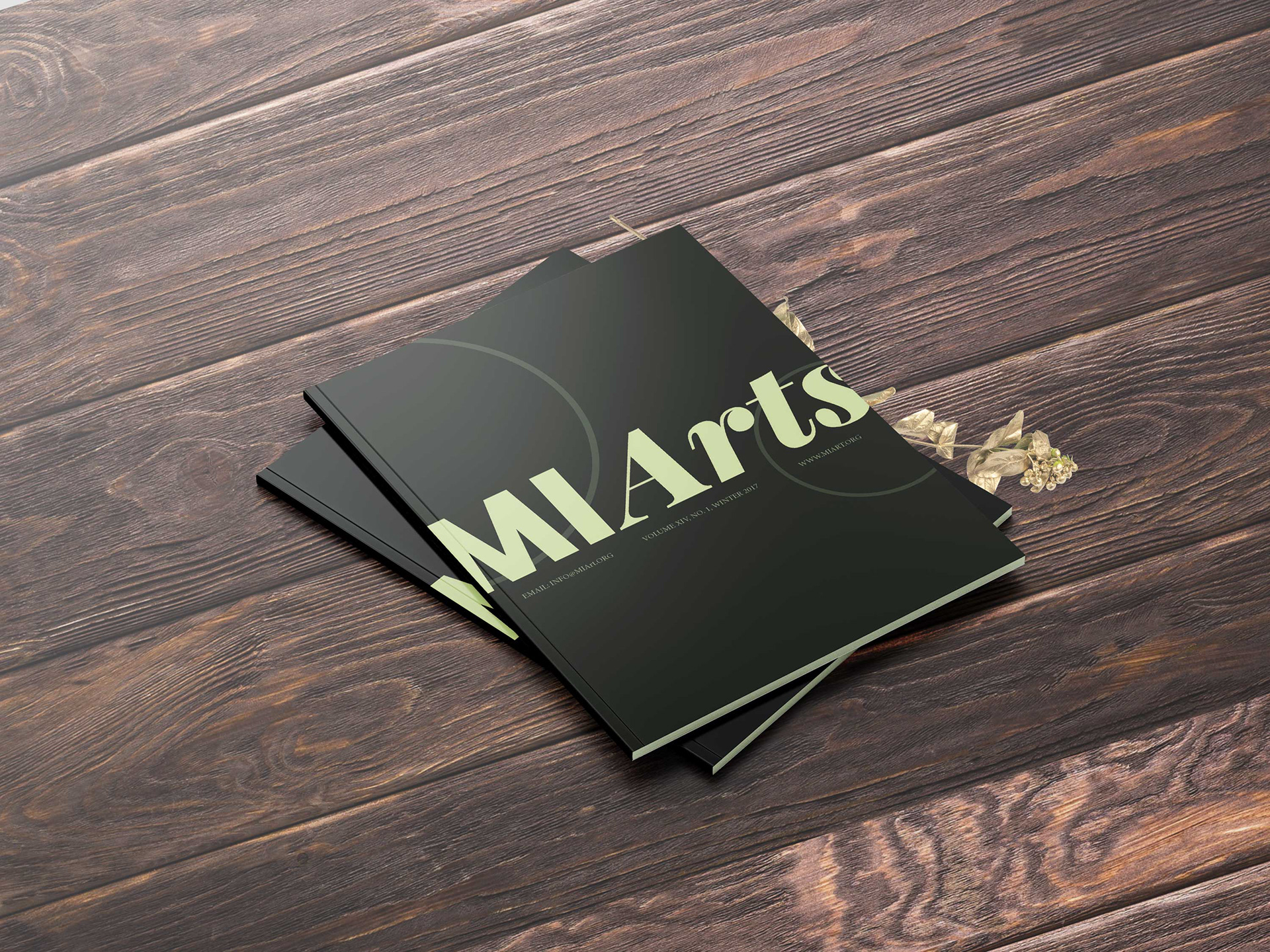
As part of my Typography course at Saginaw Valley State University, I was tasked with creating a newsletter targeted toward donating artists. The goal was to develop a layout that struck the right balance between professionalism and creative energy. The goal was to ensure it connected meaningfully with potential sponsors.
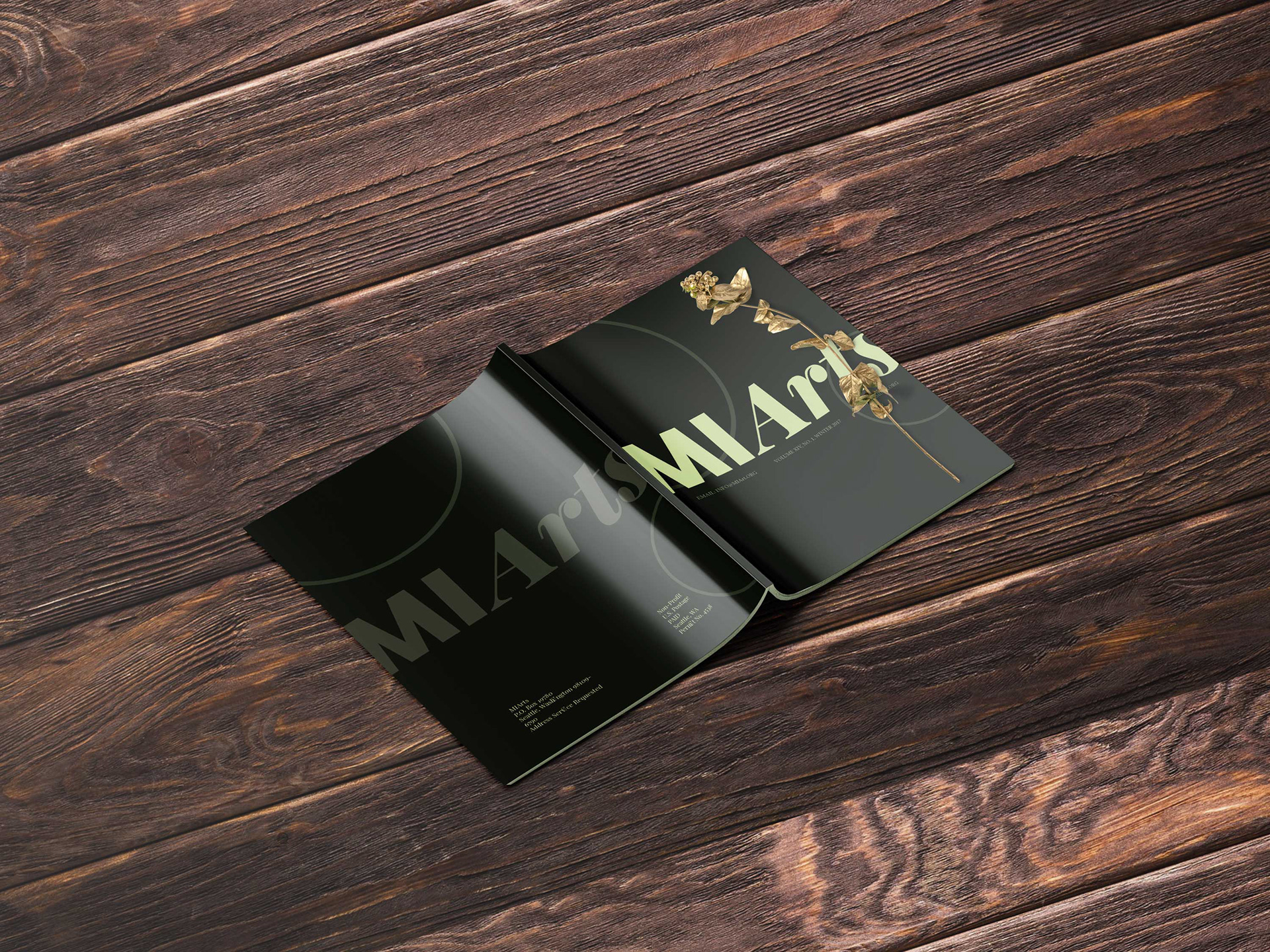
As part of my Typography course at Saginaw Valley State University, I was tasked with creating a newsletter targeted toward donating artists. The goal was to develop a layout that struck the right balance between professionalism and creative energy. The goal was to ensure it connected meaningfully with potential sponsors.
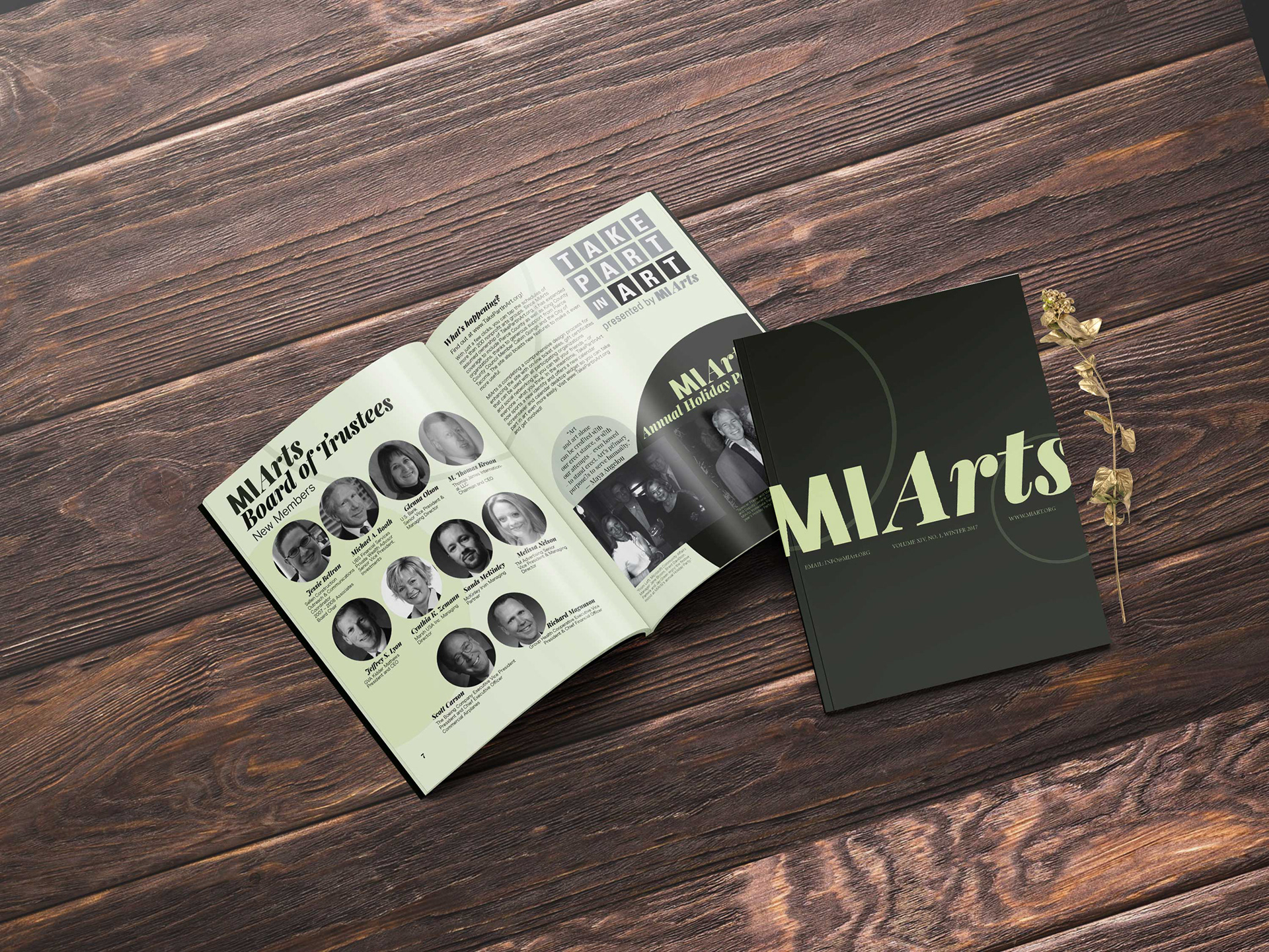
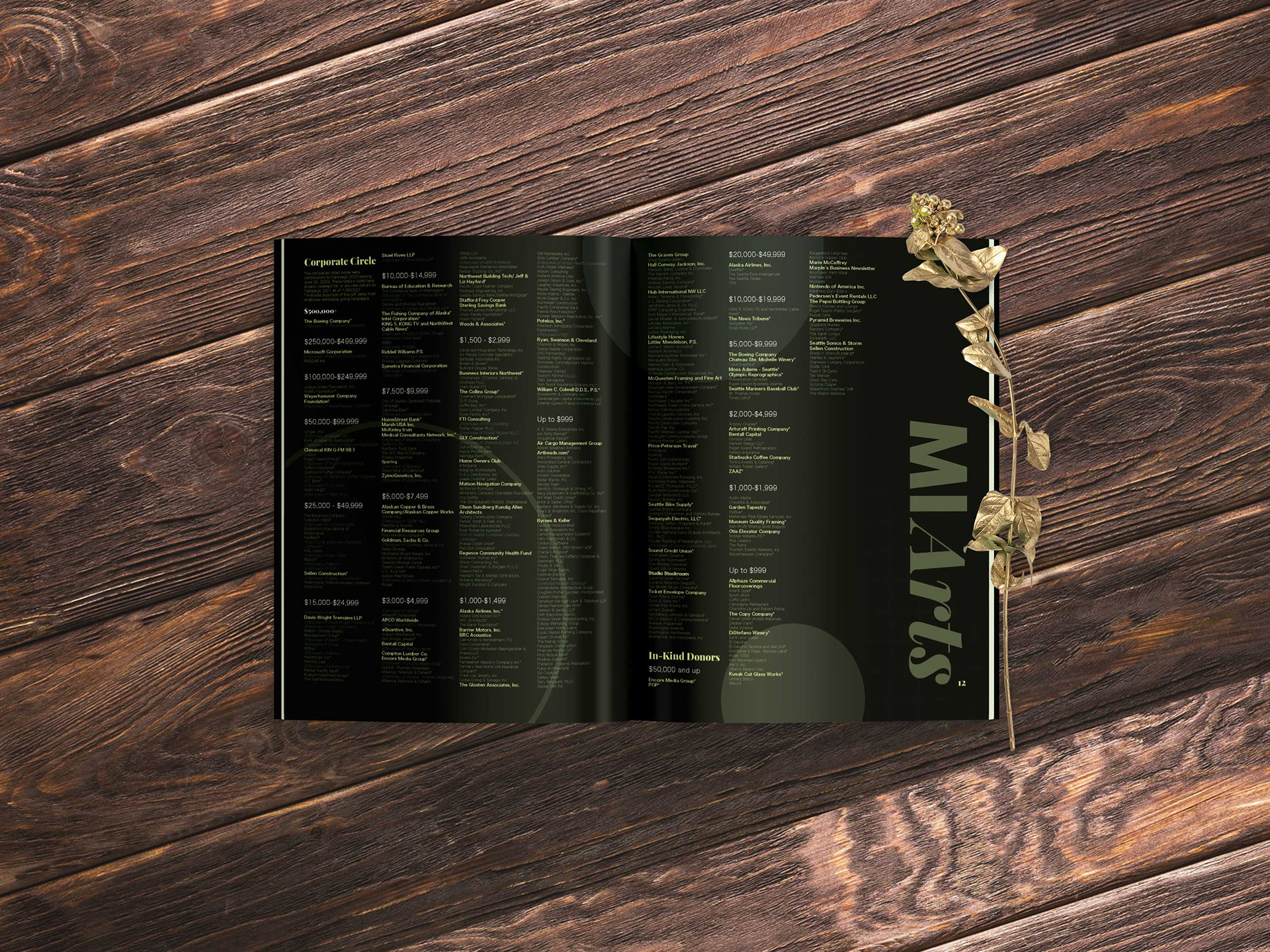
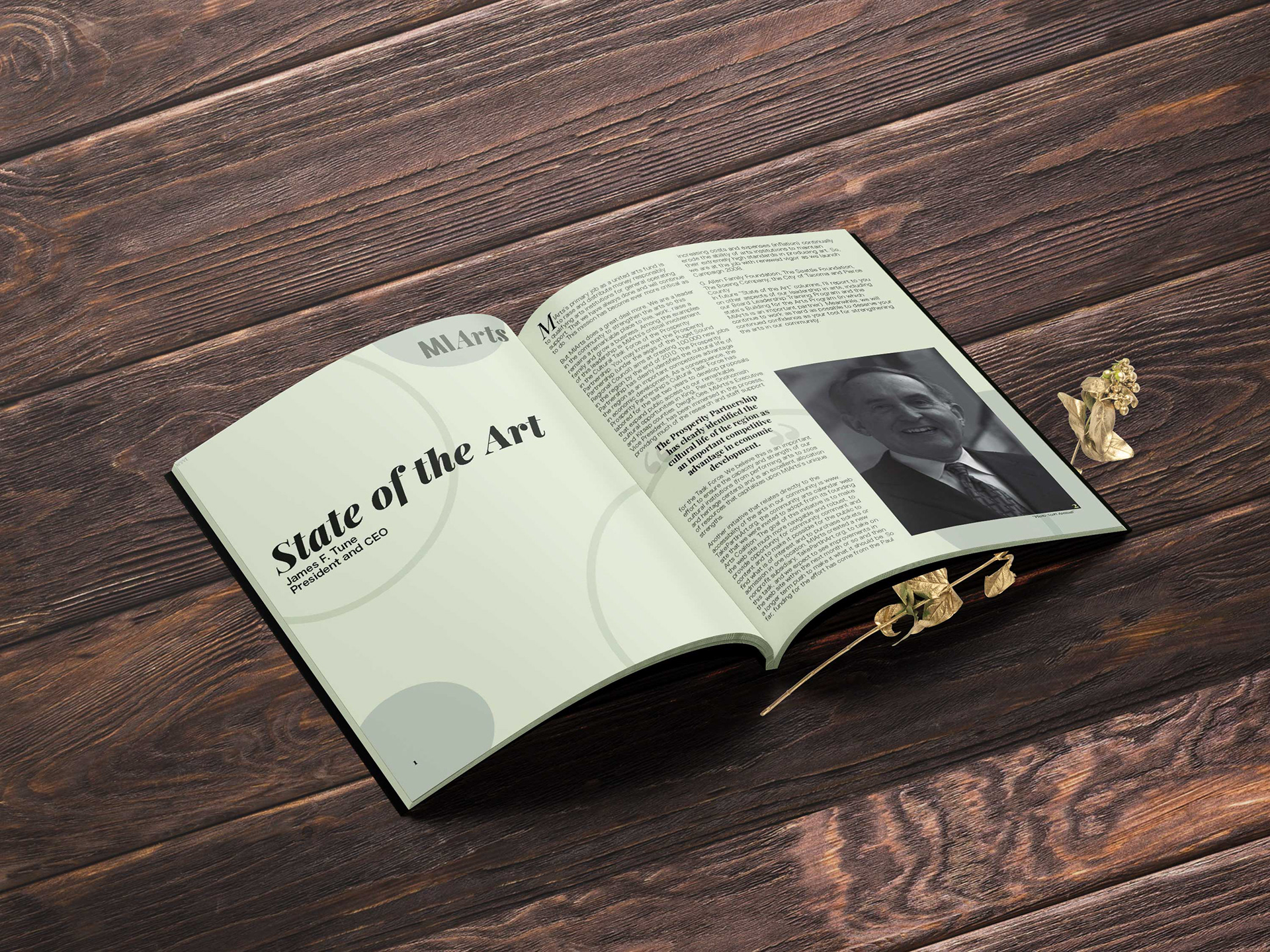
To achieve this, I employed bold circular graphic elements and a vibrant color palette to convey warmth, movement, and engagement. These design choices were grounded in a structured and refined layout, allowing for both visual impact and clarity.
Through careful attention to typography, composition, and hierarchy, I crafted a design that reflects the artistic spirit of its audience while enhancing readability and encouraging interaction. The final piece effectively communicates its message and reinforces the organization’s appeal to its creative donor base.
Software
Adobe InDesign, Adobe Illustrator
Adobe InDesign, Adobe Illustrator